
Color is the soul of home design. It breathes life into a space, sets the mood, and subtly reflects the homeowner’s personality. As we look ahead, 2026 promises an exciting shift in home interior color palettes—a reflection of evolving lifestyles, sustainability, and the growing desire for calm yet expressive living spaces.
In this comprehensive guide, we will explore the top color palettes for home interiors 2026 that are predicted to dominate homes worldwide. Whether you’re planning a renovation or simply want to refresh a room, understanding these upcoming color trends can help you make choices that feel both modern and timeless.
The Evolution of Interior Color Trends: From 2025 to 2026
Interior design is never static. What felt fresh in 2025 is subtly evolving to match the needs and sentiments of 2026.
Shifting from 2025 to 2026: What’s Changing?
| Year | Dominant Trends | Notable Colors |
| 2025 | Nature-inspired, soft minimalism | Sage green, warm beige, pale clay |
| 2026 | Bolder expression, tactile warmth | Terracotta, deep ocean blues, amber |
In 2025, homeowners gravitated towards muted earth tones and natural textures. The post-pandemic focus was on creating peaceful, grounding spaces.
However, 2026 introduces a new layer of boldness and emotional connection. While calm hues still hold their place, richer, more expressive colors are coming into focus. People are now seeking not just comfort but also spaces that inspire, energize, and tell a story.
“Color is a power which directly influences the soul.” – Wassily Kandinsky
This evolution reflects broader cultural shifts, including:
- A deeper connection to nature
- Increased focus on sustainability
- Growing appreciation for individuality in design
Let’s explore these color palettes in detail.
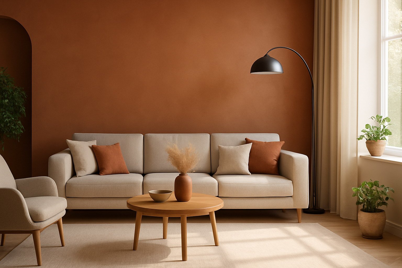
Warm Earthy Neutrals: The Foundation of 2026 Interiors
One of the standout top color palettes for home interiors 2026 is the return of warm, earthy neutrals. These colors are inspired by clay, sand, and sunbaked landscapes.
Key Colors:
- Terracotta
- Sandy Beige
- Soft Taupe
- Clay Brown
Warm earthy neutrals offer a soothing backdrop that feels organic and timeless but with an updated richness. They work exceptionally well in open-plan spaces, creating seamless transitions between living, dining, and kitchen areas.
Why Homeowners Are Embracing Earthy Neutrals:
- Versatility: These shades pair beautifully with both bold accent colors and natural textures like wood and stone.
- Comfort Factor: They exude warmth and security—perfect for homes where relaxation is key.
- Sustainability Connection: Earth tones naturally evoke eco-conscious living.
Best Uses:
- Living Rooms: Creates cozy, inviting spaces.
- Bedrooms: Encourages restfulness without being sterile.
- Entryways: Establishes a welcoming first impression.
Design Tip:
Layer various tones within this palette—such as combining terracotta walls with beige linen furniture and clay-colored accessories—to add depth and prevent flatness.
Case Study: Earthy Neutrals in a Modern Home
Project: Urban Apartment in Barcelona
Designer: Ana García Interiorismo
Palette Used: Clay, Soft Beige, Burnt Orange Accents
Result:
The designer transformed a small apartment into a warm, light-filled haven by layering sandy tones on the walls, pairing them with terracotta ceramics, and using soft taupe upholstery. Despite the compact layout, the space feels expansive and deeply comforting.
Soft Pastel Revival: A Gentle Return to Color
Pastels are making a sophisticated comeback in 2026 home interior color palettes—but this time, they’re more muted, with a dustier, grown-up quality.
Key Colors:
- Muted Lavender
- Dusty Rose
- Pale Mint
- Soft Peach
Unlike the sugary pastels of the past, 2026’s soft pastels feel calm, elegant, and versatile.
Why They’re Trending:
- Soft Expression: Perfect for homeowners looking to add subtle color without overwhelming a space.
- Blends Well with Minimalism: Pastels offer gentle contrast in minimalist interiors.
- Mood-Lifting: These tones bring lightness, helping to brighten rooms with limited natural light.
Best Uses:
- Bedrooms: Creates tranquil, serene environments.
- Bathrooms: Adds a spa-like, soothing feel.
- Home Offices: Provides a calm backdrop to enhance focus.
Styling Tip:
Pastels shine when paired with natural fibers like linen and rattan, matte finishes, and white or light wood accents. Avoid overly glossy materials to maintain softness.
Deep Oceanic Blues and Greens: Embracing Depth and Serenity
Bold, saturated hues inspired by the ocean are center-stage in the 2026 home color palettes. These colors add drama and tranquility simultaneously.
Key Colors:
- Emerald Green
- Deep Teal
- Midnight Blue
- Stormy Sea Gray
Why These Colors Are Rising:
- Statement-Making: Perfect for creating focal points like feature walls or cabinetry.
- Rooted in Nature: Brings the calming power of water and depth of forests indoors.
- Pairs Beautifully with Neutrals: Balances well with white, beige, and soft metallics.
Best Uses:
- Living Rooms: As feature walls or statement sofas.
- Kitchens: For bold cabinetry paired with marble or wood countertops.
- Bathrooms: Evokes a luxurious, spa-like ambiance.
Design Tip:
Use contrasting light elements like brass hardware or soft lighting to prevent dark colors from making the space feel smaller.
Sun-Kissed Yellows and Warm Ambers: Injecting Optimism
As homeowners seek happiness and light in their spaces, sun-kissed yellows and ambers are emerging as joyful color choices in 2026.
Key Colors:
- Marigold
- Amber
- Ochre
- Buttery Yellow
Why They’re a Top Pick:
- Energetic and Uplifting: Brings instant warmth to interiors.
- Perfect Accent: Great for smaller touches like throw pillows, art, or a painted alcove.
- Reflects More Light: Especially useful in north-facing rooms that receive cooler daylight.
Best Uses:
- Dining Areas: Encourages conversation and conviviality.
- Kitchens: Brightens cooking spaces.
- Hallways: Creates a cheerful transition between rooms.
Styling Tip:
Pair yellows with natural woods, white trims, or olive greens to balance vibrancy and prevent the space from feeling overly bright.
Monochromatic Grays with a Modern Edge
Grays remain timeless but evolve in 2026 into layered, monochromatic schemes with texture-driven contrast.
Key Shades:
- Soft Dove Gray
- Stone Gray
- Charcoal
Why Grays Are Still Essential:
- Sleek and Modern: Offers sophistication, especially in urban homes.
- Perfect for Texture Play: Looks best when combined with velvet, concrete, glass, and metal.
- Flexible: Easily adapts to different design styles—industrial, minimalist, or classic.
Best Uses:
- Bedrooms: Creates restful, neutral spaces.
- Home Offices: Adds a professional and balanced look.
- Bathrooms: Clean, fresh, and timeless.
Design Tip:
Mix light, medium, and dark grays within one room to add depth and interest. Incorporate soft black accents to create a contemporary edge.
Nature-Inspired Greens: Biophilic Beauty
Biophilic design continues to dominate, and in 2026, green color palettes rooted in nature are taking center stage.
Key Colors:
- Olive
- Sage
- Moss
- Eucalyptus Green
Why Greens Are Growing:
- Connects the Indoors with Nature: Perfect for promoting relaxation and well-being.
- Timeless Appeal: Neither trendy nor outdated, greens feel enduring.
- Pairs with Natural Materials: Works well with stone, jute, and wooden textures.
Best Uses:
- Kitchens: Green cabinetry or tiles paired with marble.
- Bathrooms: Spa-like, calming retreats.
- Home Offices: Boosts productivity and calm.
Design Tip:
Layer various greens in plants, textiles, and wall colors to fully embrace the biophilic look.
Bold Jewel Tones: Vibrancy with Sophistication
Rich jewel tones are resurging in 2026 home interior color trends as people look to make confident, artistic design statements.
Key Colors:
- Ruby Red
- Sapphire Blue
- Amethyst Purple
- Emerald Green
Why They’re Trending:
- Luxe Feel: Adds depth and luxury.
- Perfect for Accent Pieces: Ideal for statement furniture, rugs, or artwork.
- Pairs Beautifully with Neutrals: Especially beige, gray, and soft white.
Best Uses:
- Dining Rooms: Encourages a rich, inviting atmosphere.
- Living Rooms: Use jewel-toned sofas or rugs for dramatic effect.
- Reading Corners: Cozy, indulgent feel with velvet chairs or curtains.
Styling Tip:
Balance these bold tones with muted surroundings and minimal patterns to prevent visual clutter.
Soft Black and Charcoal Accents: The Rise of Quiet Drama
Soft black is gaining traction as a primary or accent color in 2026 home interiors. It’s elegant, timeless, and surprisingly versatile.
Key Colors:
- Graphite
- Soft Black
- Charcoal
Why It’s Popular:
- Grounds a Space: Adds structure and focus.
- Surprisingly Warm: Soft black tones, especially in matte finishes, can feel cozy.
- Perfect with Light Woods and Whites: Creates stunning contrast.
Best Uses:
- Kitchen Islands: Black cabinetry balanced with light countertops.
- Bathroom Fixtures: Matte black taps, handles, and frames.
- Accent Walls: Dramatic, yet not overpowering.
Design Tip:
Use warm lighting, soft textiles, and natural plants to balance dark hues and prevent coldness.
How to Choose the Right Palette for Your Home
Selecting the perfect 2026 color palette for your home interior depends on more than just trends.
Key Considerations:
- Lighting: South-facing rooms can handle cooler hues, while north-facing rooms benefit from warmer shades.
- Room Size: Dark colors can cozy up large spaces but may overwhelm smaller rooms if not balanced properly.
- Personal Preference: Always prioritize colors that make you feel good.
- Existing Furniture: Consider whether your current pieces complement or clash with new color choices.
Quick Tips for Testing:
- Use paint samples and observe them at different times of the day.
- Try peel-and-stick color swatches for easy, mess-free testing.
- Paint test patches on multiple walls to see how lighting affects the color.
Matching Color Palettes to Styles:
| Interior Style | Ideal Color Palettes |
| Modern | Monochromatic Grays, Soft Blacks |
| Bohemian | Warm Earthy Neutrals, Sun-Kissed Yellows |
| Minimalist | Soft Pastels, Nature-Inspired Greens |
| Luxury | Jewel Tones, Deep Oceanic Blues |
Conclusion
The top color palettes for home interiors 2026 beautifully balance comfort, boldness, and connection to nature. From the grounding warmth of earthy neutrals to the vibrant energy of jewel tones, this year’s palettes invite homeowners to tell their story through color.
Explore, experiment, and embrace the colors that make your home feel uniquely yours.


